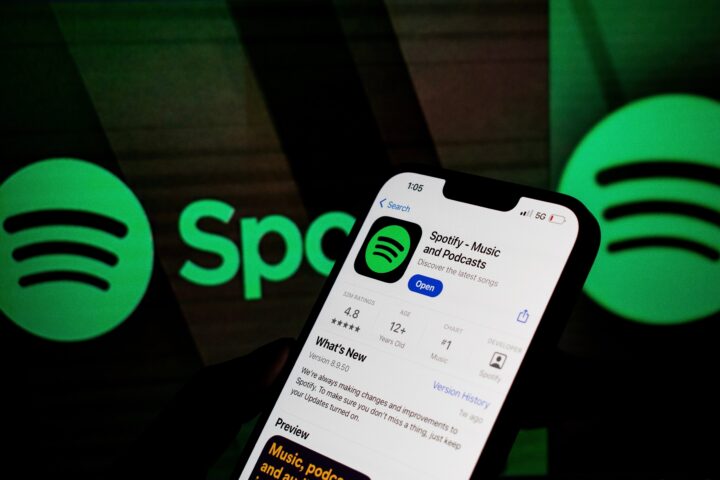
Spotify has given its iconic green logo a dramatic makeover, replacing its familiar flat design with a sparkling green disco ball icon that has taken the internet by storm.
Rolling out across iOS on May 13, 2026, the redesign marks the streaming giant’s 20th anniversary celebration and has instantly divided millions of users worldwide.
The new Spotify icon transforms the classic green circle into a shimmering, textured disco ball complete with depth, gradients, and a glitzy mirror-ball finish.
Crucially, the three iconic soundwave lines that have defined Spotify’s identity since its founding in 2006 remain intact, now embedded within the sparkling new design.
The logo is temporary. The app has changed its logo to celebrate its 20th anniversary.
So, the disco ball is like a cute happy birthday party message for users. It will eventually return to the classic green circle, Spotify has not replaced its core brand identity permanently, it has given it a party costume for the anniversary season.
None of that context stopped the internet from immediately losing its mind about it.
Why Everyone Panicked When They Opened The App
Many users initially believed Spotify had permanently redesigned its branding.
However, the company’s classic green logo remains intact, with the disco ball functioning as a special anniversary symbol rather than a complete corporate rebrand.
The confusion itself helped the campaign go viral, increasing searches for “why is Spotify a disco ball,” a phrase that exploded in search volume within hours of the rollout beginning.
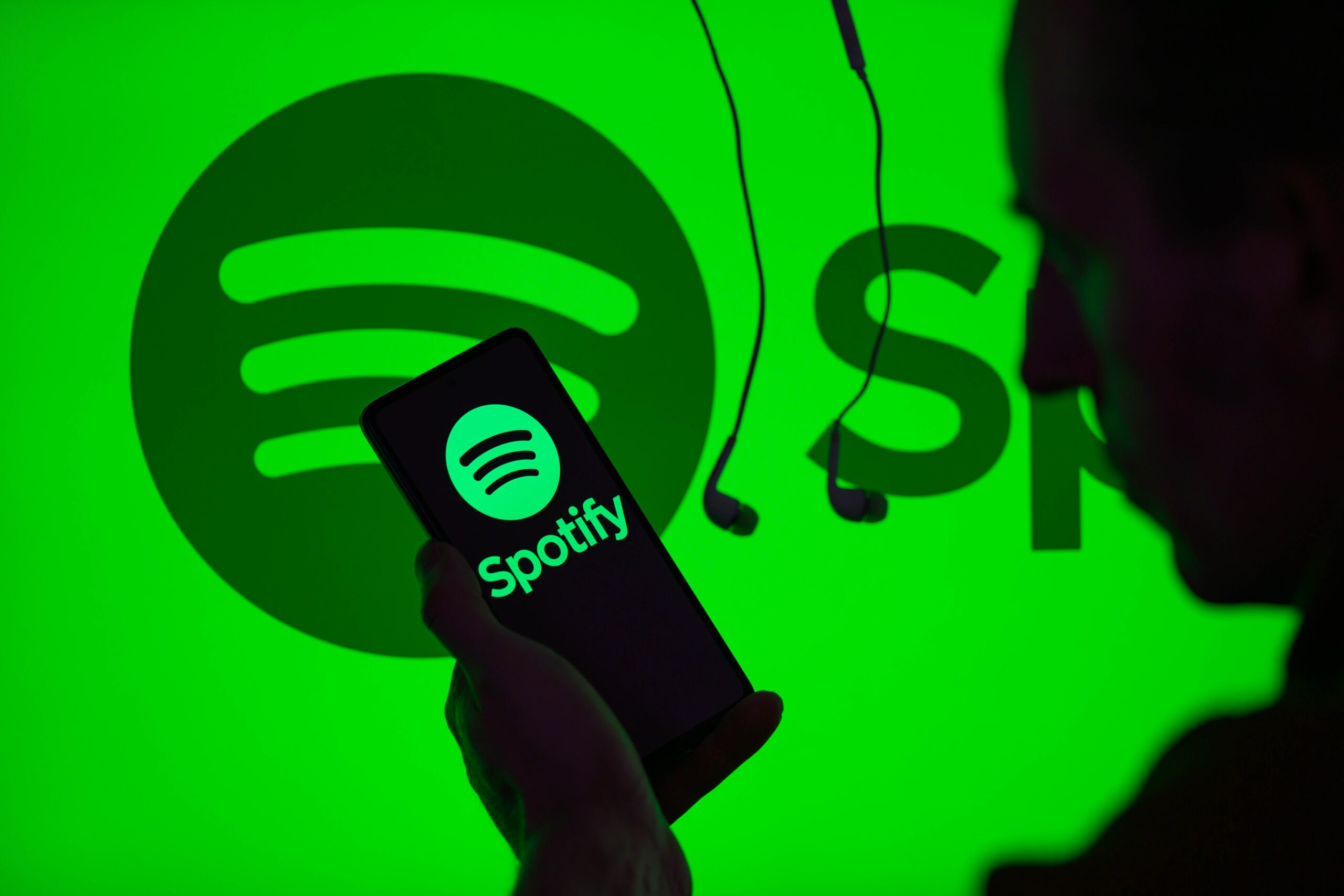
The panic reaction follows a predictable pattern for app icon changes. When a company that 600 million people use every day alters the icon sitting on their phone’s home screen, the response is immediate and universal, every user notices simultaneously and every user has an opinion.
The icon is not just branding. It is the specific visual shortcut that represents something people use for their most personal moments, the song they played during their last road trip, the playlist they built for a relationship that is now over, the album they listened to on repeat during the hardest month of their life.
When that icon suddenly looks different, the reaction is disproportionate to what actually changed. Spotify still works exactly the same way.
The catalog is identical. The algorithms are the same. The only thing different is the picture on your home screen.
And yet the internet treated it as a news event, because it is one, the largest music streaming platform in the world changed what millions of people see every time they reach for music.
How Did The Internet React?
The reviews of the new Spotify logo have been mixed. One person on Reddit said, “It’s ugly but I like it. Everything is so perfectly sterile and over-considered lately. Give me weird vibes and feelings any day over cold data-driven design insights.”
Another simply said, “The new Spotify logo is horse sh*t.”
A further said, “Spotify updated their logo today. If it’s only temporary for the 20th anniversary, acceptable. If it’s permanent, absolutely not for me.”
The range of those three reactions captures the full spectrum of how people have been responding.
The first is the most interesting, the acknowledgment that the logo is objectively not beautiful by the standards of contemporary design, immediately followed by the admission that the ugliness is part of the appeal.
The second is the direct response of someone who was not asking to have their visual expectations disturbed. The third is the conditional acceptance that most users have landed on after realizing the change is temporary.
The “ugly but I like it” contingent has been growing as the hours pass and the panic of the initial discovery gives way to the specific pleasure of a large corporation doing something a little weird and a little unpolished.
The flat, minimalist icon era of tech design has lasted long enough that a green disco ball with depth and texture and actual visual personality feels genuinely refreshing to a significant portion of the audience that encountered it.
Why A Disco Ball?
Spotify transformed parts of its branding into a disco ball theme to celebrate 20 years of music discovery, parties, streaming culture, playlists, artists, and fan communities.
Spotify explained that the platform has spent the last 20 years turning “listening into community” and “moments into movements.” The disco ball symbolizes those shared music experiences across generations.
The specific choice of a disco ball rather than any other visual metaphor is doing more conceptual work than it might first appear.
A disco ball is a communal object, it only exists in the context of other people. You do not put a disco ball in a room where one person sits alone. You put it in a room where people are together, where the light it scatters reaches everyone at once, where the reflection of a single source multiplies into something that fills a space with movement and shared experience.
That is what Spotify is arguing it has been for 20 years. Not just a delivery mechanism for music, but a platform where listening became social, where people shared playlists, discovered that they had the same taste as someone they had just met, sent each other songs as a form of communication that words could not accomplish.
The streaming era coincided with the specific cultural moment when music went from something you carried in your pocket to something you discussed, compared and connected over.
The shift moves decisively away from the flat, minimalist aesthetic that has dominated tech design for years, leaning instead into bold Y2K nostalgia energy with a shiny, light-catching surface that is anything but subtle.
The timing of the Y2K aesthetic moment in popular culture is not accidental.
The generation that is now in its early to mid-twenties was born in the late 1990s and early 2000s, they have no personal memory of Y2K but have been surrounded by its visual language through their formative online years, and they have reclaimed it as an aesthetic that feels retro and contemporary simultaneously.
The Flat Icon Era
After years dominated by flat minimalism, many companies are experimenting with more expressive visuals, including metallic textures, glass effects, gradients, and three-dimensional styling. Spotify’s disco ball icon fits directly into that movement.
The flat design era, which dominated tech visual language from roughly Apple’s iOS 7 in 2013 through most of the following decade, was a reaction against the skeuomorphic design that preceded it.
Skeuomorphic design tried to make digital interfaces look like physical objects, buttons that appeared to have depth and shadow, icons that looked like the literal objects they represented.
Flat design stripped all of that away, arguing that digital interfaces should look digital, clean, geometric, uncluttered.
The pendulum has been swinging back for several years. Glassmorphism, the frosted glass visual effect popularized in Windows 11 and Apple’s more recent design work, started reintroducing texture and depth.
Gradients, which flat design had declared unfashionable, came back. And now Spotify’s disco ball, which is essentially a textured, three-dimensional object rendered with depth and light physics, is the most visible single example of that swing applied to one of the world’s most recognized tech brand identities.
Whether the disco ball signals that Spotify’s design team is genuinely rethinking its visual identity or whether it is purely a limited-time anniversary celebration is a question that will be answered when the anniversary period ends and the regular icon either returns or does not.
The Connection To The Party Of The Year(s) Feature
The disco ball is not a standalone announcement. The Spotify disco ball icon is essentially a temporary celebratory logo tied to the Spotify 20 anniversary event.
As part of the campaign connected to the new Spotify logo, Spotify launched a mobile-only in-app experience called Spotify 20: Your Party of the Year(s).
This nostalgia-focused feature allows users to explore their complete listening history using never-before-shared personal streaming data.
The two pieces of the campaign work together as a single argument. The disco ball says, we are having a party, and the party is about your history with music.
The Party of the Year(s) feature says, here is your personal history with music, going back to the day you joined, expressed in data that has never been shared with you before.
The visual and the interactive experience are designed to produce the same emotional response through different channels, the icon reminding you that music is communal and celebratory, the data feature reminding you specifically why music has been meaningful in your own life.
Spotify also launched the campaign in more than one hundred forty countries and multiple languages, proving how important the anniversary is for the company’s global image.
The scale of the rollout ensures that the disco ball icon moment is not a regional campaign or a market-specific test.
Every Spotify user on iOS who opened the app on May 13 or later encountered the same green disco ball on their home screen.
That simultaneous, universal experience is itself part of the campaign’s design, the moment of shared discovery replicated across 600 million accounts at once.
The Deeper Point About Apps And Memory
People no longer see apps as simple tools. Music platforms now hold years of memories, emotional experiences, relationships, and personal identity.
This is the uncomfortable truth that the Spotify disco ball logo change makes visible.
The reason the icon change provoked such an immediate and intense reaction from so many people is that the icon represents something they have an emotional investment in.
It is not like changing the logo on a spreadsheet application or a PDF reader.
It is changing the logo on the application that has been the soundtrack to their adult life, or, for younger users, their entire conscious memory.
When you look at that icon, you are not just identifying a music streaming service. You are identifying the place where the songs that mattered to you live. The logo change is temporary.
The discomfort it caused by touching that emotional association, even briefly, even with a green disco ball, is a reliable indicator of how deeply embedded Spotify has become in the way people relate to music.
The party is 20 years old. The disco ball is spinning. Eventually the regular icon will come back.